
Clarking About
‘2001: a Childhood's End’

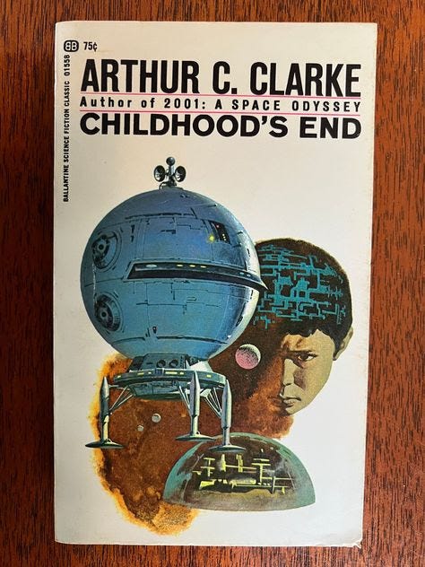
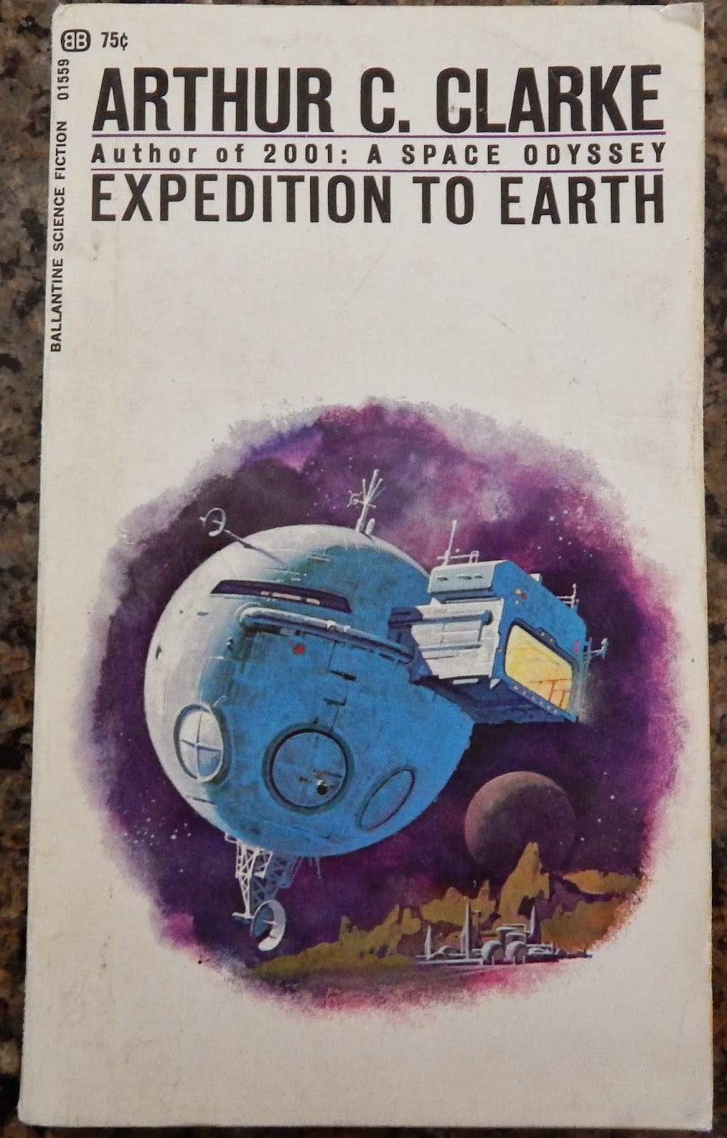
This 1969 Ballantine edition of Arthur C Clarke’s celebrated 1953 novel is a curio. The cover art (the artist is uncredited, but may have been Dean Ellis) has taken the actual subject of the book—the coming of mysterious aliens to Earth to usher in a utopian new age, in order that a generation of ESP-gifted children can be born and grow safely to adulthood, so as to initiate the next phase in human evolution—and combined it with, as the tagline under the author’s name reminds the readers, the huge success of Kubrick’s 2001: A Space Odyssey. The globular spacecraft is a recognisable plagiary from that movie: it is the ship that travels from the orbital space station to the lunar base.
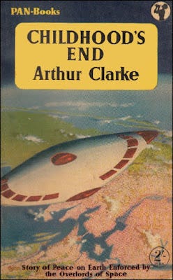
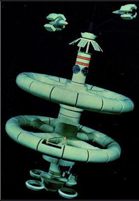
Presumably the suggestion is that the alien ‘Overlords’ from Clarke’s story descend to earth in this craft, although it looks incongruous. In the book the Overlords’ craft is described as a saucer, which is more often how cover artists have portrayed it, as in this 1956 Pan paperback edition:
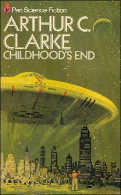
Or this Pan reissue from 1974:
The intention is, nakedly, to cash-in on Clarke’s association with 2001. Indeed, in the aftermath of the movie Ballantine reissued five of Clarke’s titles with ‘2001’-esque cover art, although in the case of the other four the original prototype spaceships and space-station are modified, altered, adaptations on a 2001-theme rather than actual plagiaries.
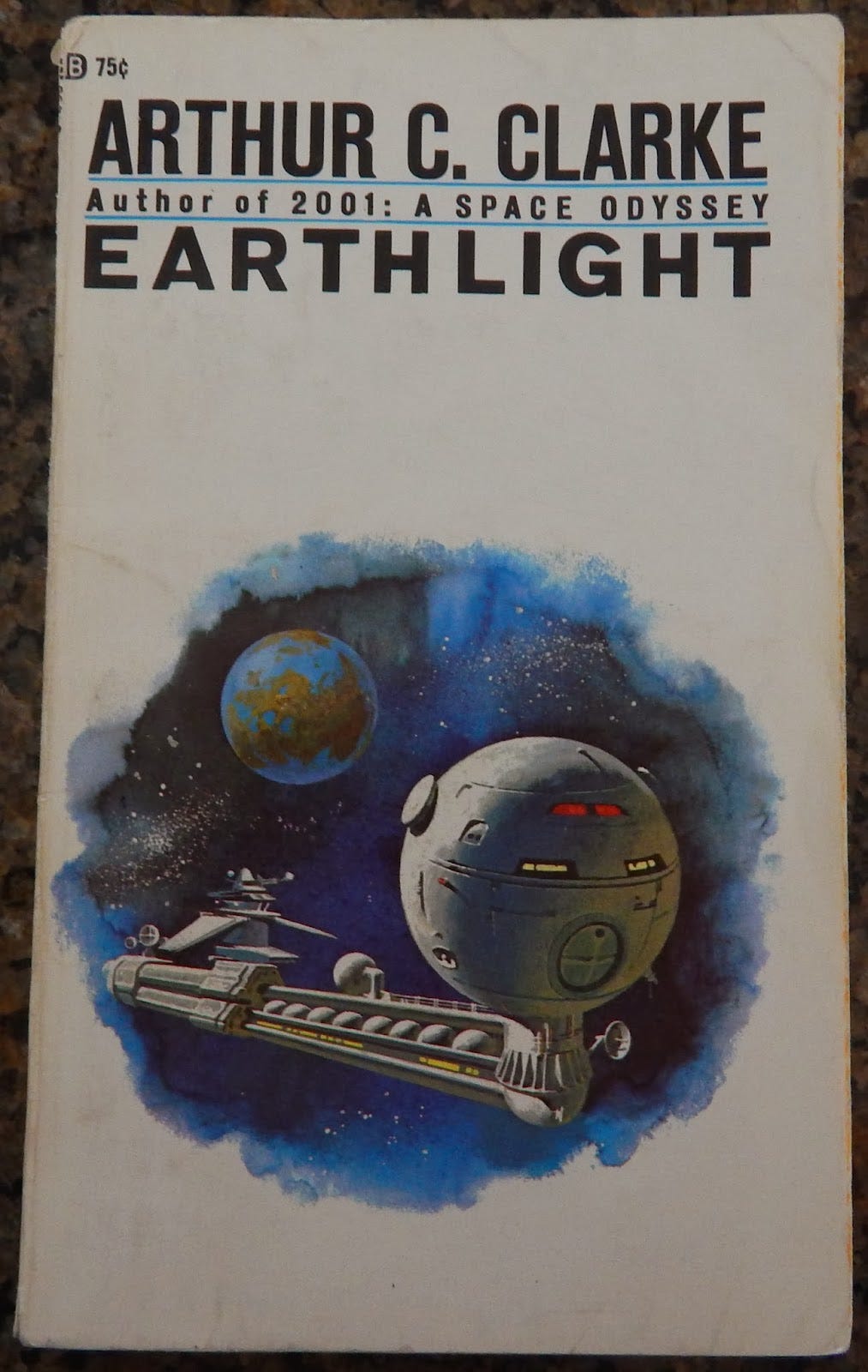
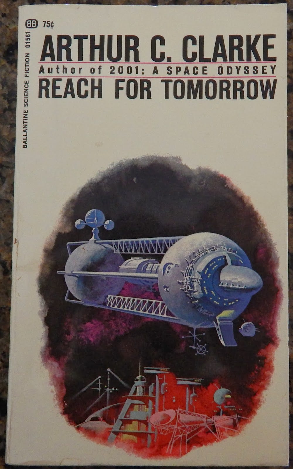
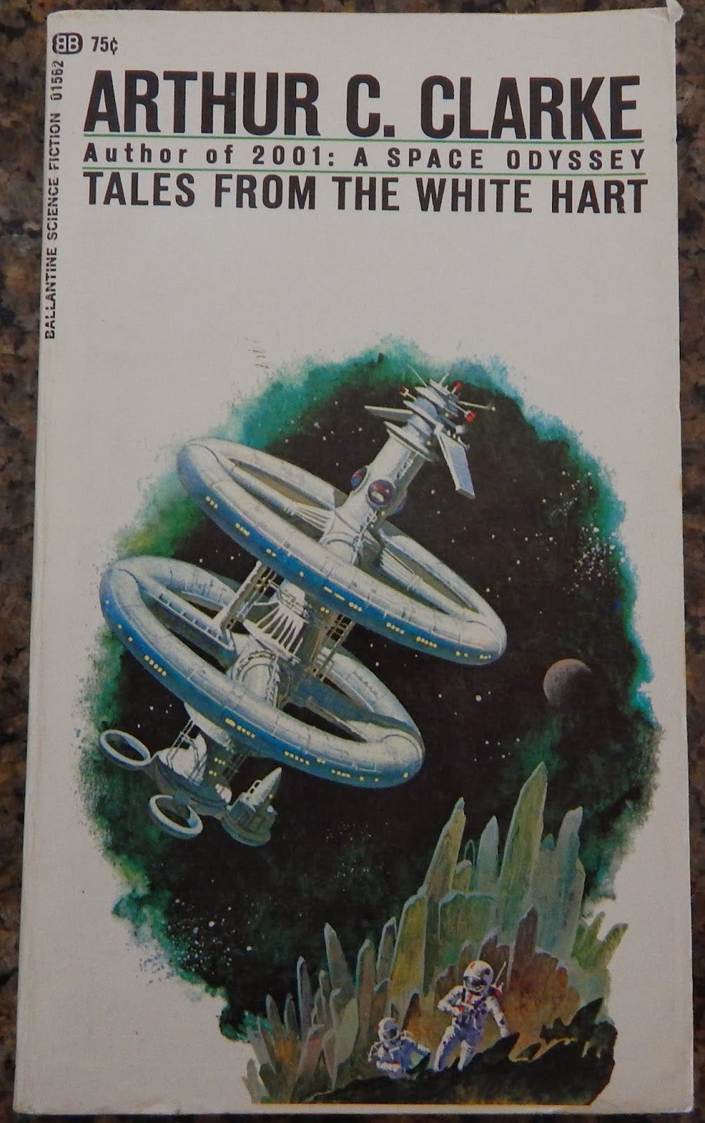
The White Hart, in the title of that last collection of short stories, is a London pub, not an orbital space station, although punters unfamiliar with the book might assume the latter. It is of a quite different design to the space-station that appears in 2001, and in fact Ellis (if he was the artist) was copying a different prototype: the space-station model that appeared in the ‘Futurama’ pavilion of the 1964 New York World’s Fair.
On the one hand there is something rather deplorable about this. Childhood’s End is a great novel, but its style and flavour, its vibe, are very different to 2001. Implying, to potential book-purchasers, that this book is similar to Kubrick’s movie comes close to flat misrepresentation, a kind of advertising malpractice (to be fair: Clarke was closely involved with Kubrick in creating the 2001 storyline, which was based on one of his early short-stories, and he did go on on to write the tie-in novelisation). But in another sense what the artist is doing here, especially with the other four titles in this reprint series, has interesting parallels with how special-effects artists and cinema technicians visually rendered their space-age futures. A typical strategy (not on 2001, where Kubrick insisted all models be built from scratch, based on detailed production sketches and designs) is to buy up large numbers of Airfix and other model kits, of planes, ranks, ships and other things, and then assemble them according to the requirements of the imagined world of the SF film, repainting and repurposing, juxtaposing elements in original ways. This was how the original suite of space-ships in George Lucas’s Star Wars (1977) was created. And the artist here has, independently, essayed something similar with his or her art: taking elements from various visual sources and recombining them into something that both looks familiar and yet is, in small ways, new. It is, in fact, a common strategy in SF art and design.
Clarke wasn’t the only author for whom 2001 was cannibalised for cover-art. Here is the 1970 Pan ‘Lozenge’ edition of Heinlein’s The Door Into Summer (1956)
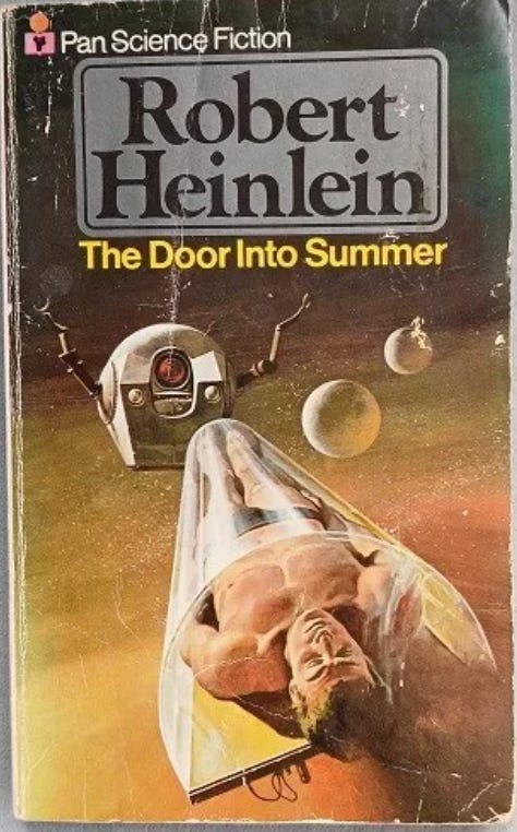
I’m not sure who the artist is here: it may be Gino D’Achille.
Really interesting piece - any chance your unpublished Unbound science fiction art book might find another publisher? Love to see it in print!
Many thanks for your very interesting post, Adam! To make an obvious point that was probably made a hundred times before, that spaceship looks like the Death Star. I assume George Lucas took inspiration from the cover art?