
Chris Moore
Science fiction and hyperrealism


Chris Moore died ten days ago: 7th February 2025. I never met him, but I was one of the great many writers for whom he provided cover-art, and I own a Chris Moore original—the art he created for my first ever published novel, Salt, above. He was a preeminent science-fiction artist across seven decades, produced some hugely memorable album covers, and illustrations in many modes.
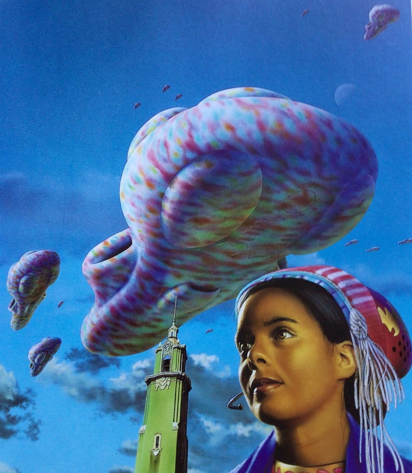
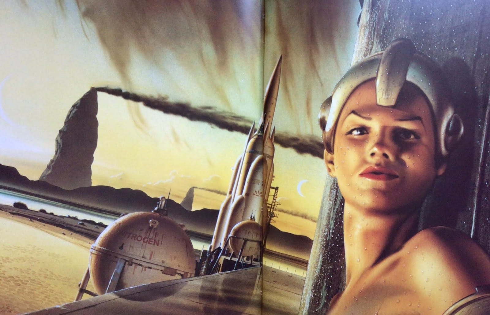
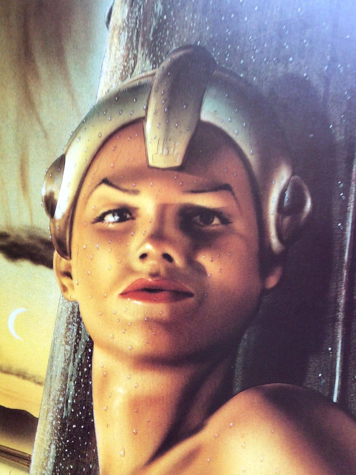
Characteristically Moore produced a type of science-fictional art that represents imaginary objects in a hyper-realist style; or more precisely, presents a mix of actual objects, real people—his cover-art very often includes human models, many of which are carefully painted portraits of friends and neighbours—combined with fantastical or extrapolated-technological objects. Above, for instance, is the cover Moore created for the HarperCollins 1997 reissue of Philip K Dick’s Our Friends From Frolix 8 (the novel originally published 1970). Though the tower is a recognisable human structure, the bizarre, seemingly upholstered giant spacecraft hovering in the sky are purely imaginary. Of the young woman in the foreground Moore said ‘the model for this image was a friend that I met through the Preston sf group. Her name is Sarita. I’ve used her a couple of times in different paintings. I’m told she’s thrilled with it—almost as thrilled as her father was, because he’s also a huge Philip K Dick fan’ [Stephen Gallagher, Journeyman: the Art of Chris Moore (Collins and Brown 2000), 119].
It looks like a digitally created image, but Moore’s art actually represents human facility and technical precision of a very high calibre. As John Grant notes: ‘because of the precision of line and photorealism of Moore's work, it was assumed by many viewers that he was working digitally long before he in fact started doing so. The transition came about as a result of Moore's friendship with leading digital sf artist Fred Gambino, whom he met at the 1995 Worldcon in Glasgow; even so, he resisted the move for some further years, and still tends to use the computer as an aid rather than for the entirety of an artwork’ [Grant, ‘Moore, Chris’, in Clute and Langford (eds), The Encyclopedia of Science Fiction (Reading: Ansible Editions, updated 19 February 2024)]
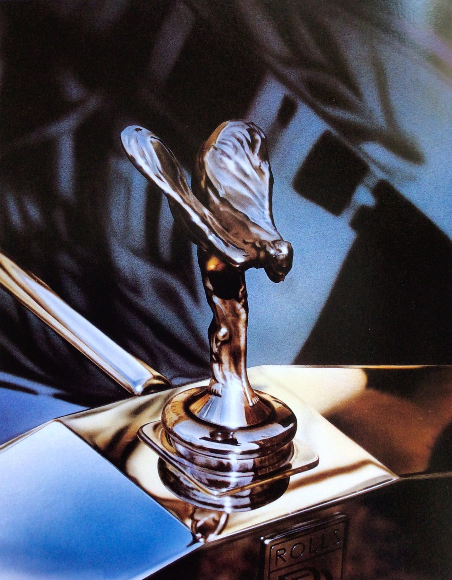
Moore's early work as a commercial artist foregrounded his photorealist skills, as with this painted Rolls Royce marque, created as one of a series of books about classic cars, which could easily be a photograph:
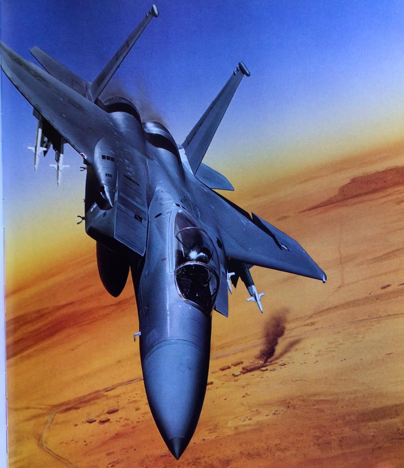
Here Moore paints a USAF F-15E Strike Eagle (for the cover of Richard Herman’s 1990 military thriller Force of Eagles) with dynamic exactitude:
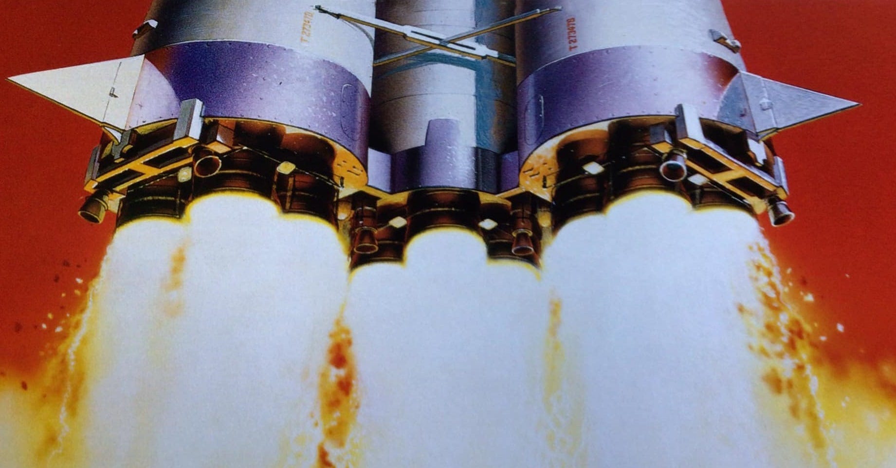
This image, called ‘Russian Rocket’, commissioned by the New England Space Museum, approaches SFness, although in every element except the cherry-red sky, it could (again) be a photograph:
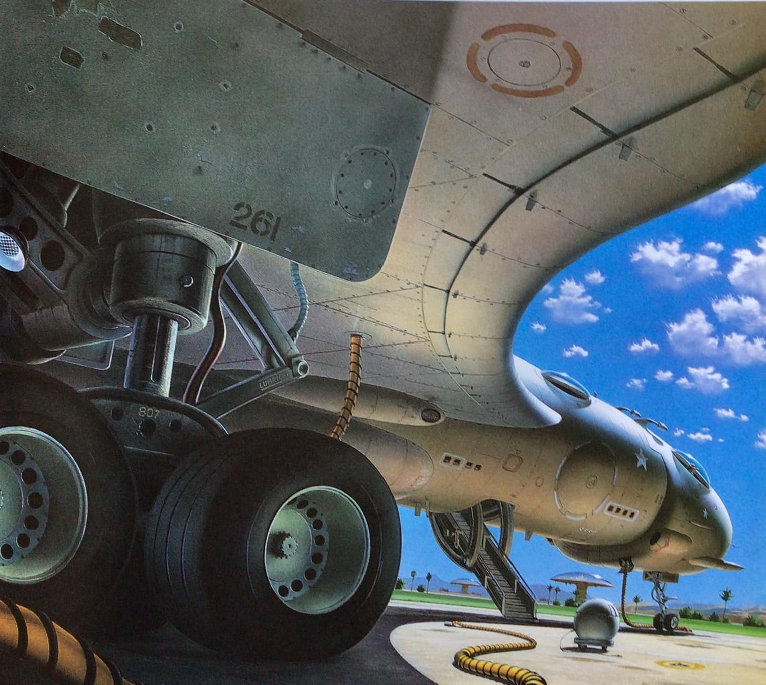
Moore’s skill enabled him to combine elements of photo-accurate mimesis with elements of fantastical extrapolation, either by putting elements of both into the same image, or by basing his imagined inexistent subjects on elements of the recognisable. For example: he has painted many jets and airplanes for military adventure thriller book covers; when he creates a futuristic aircraft—here for the cover of HarperCollins 1990 collection of Philip K Dick short fiction We Can Remember It For You Wholesale—it is at once familiar and unfamiliar, both like and unlike actual aircraft, and situated in a landscape that is both Earthlike and not (are those airport control towers in the background, or domed cities?)
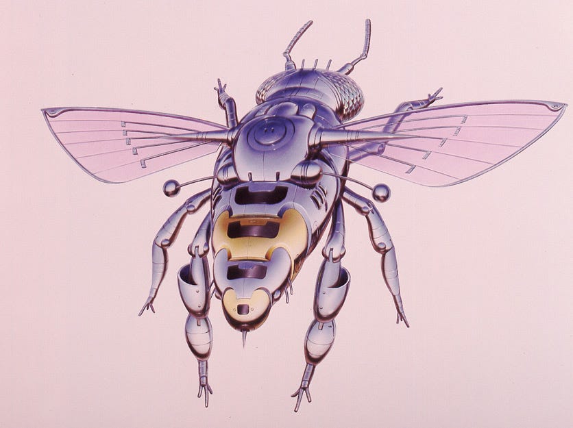
Moore's ‘Robotic Bee’ (1993) renders an unreal object with hyper-realist exactitude, achieving something almost surrealist—just as Meret Oppenheim’s gazelle-fur teapcup and saucer (‘Object’ 1936) renders something inorganic in organic materials, so Moore renders something organic in terms of the inorganic metal and plastic, complicating the relationship between the live and the unalive.
When Moore’s composition is entirely imagined, as with this cover art for Dick’s Beyond Lies The Wub (1993), his accuracy at rendering the textures of the objects portrayed is photorealist: the metal of the flying craft, the stony landscape, the quality of light.
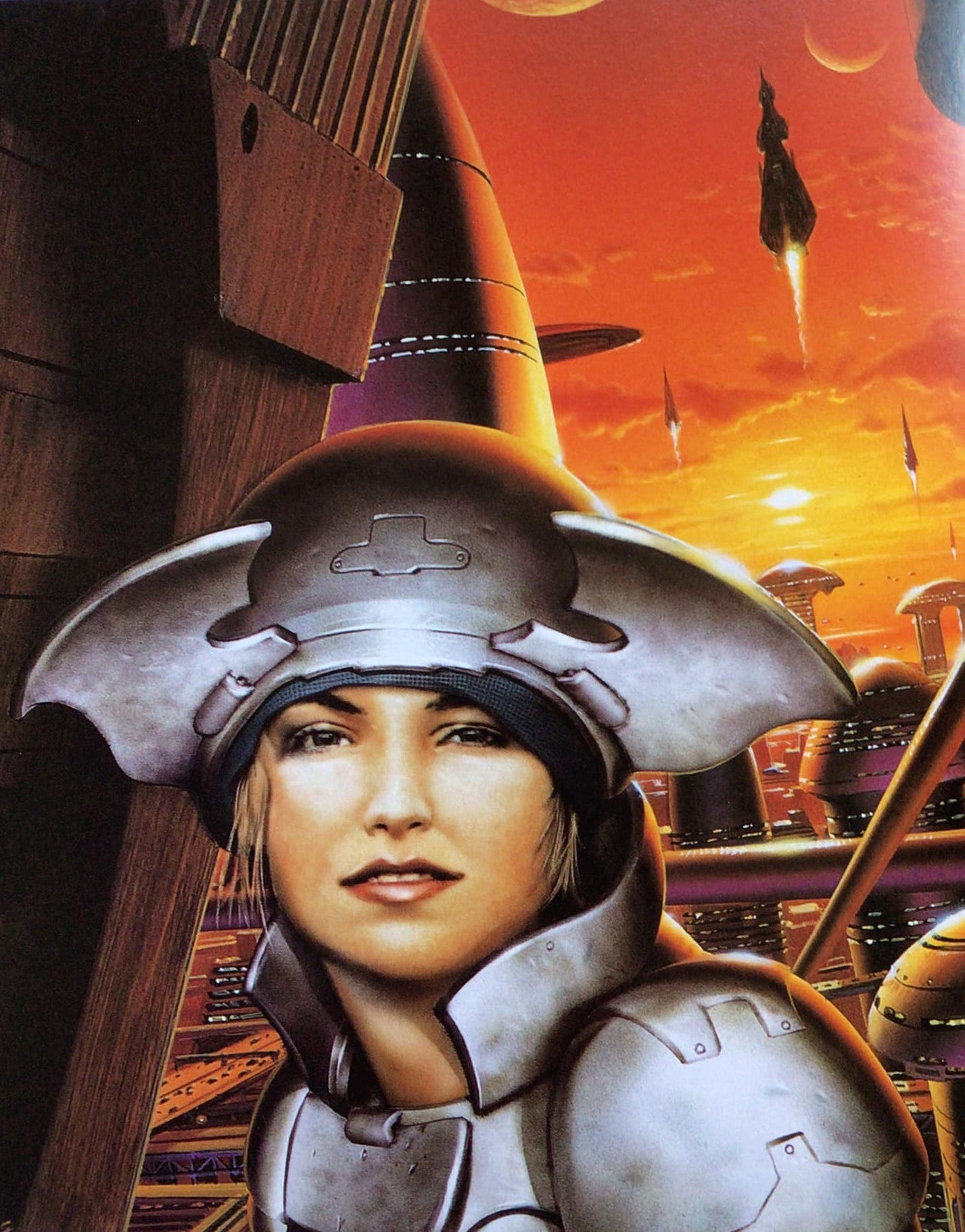
Later Moore tended to include faces in his non-mimetic compositions. The young woman looking out at us, in this cover-art for the SF Masterworks reissue of Samuel Delany’s Babel-17 (1998), is young; her hefty suit of space-armour looks old, distressed, and the high-tech city behind her appears to be being evacuated by a flotilla of rockets, being abandoned. The sky is a sunset redder than in Turner’s ‘The Fighting Temeraire’ (1838), and perhaps owing something to that image in its juxtaposition of youth and age.
As cover art for Babel-17, there is a mismatch. This image has nothing to do with Delany’s alien-language-and-translation novel ... any more than the cover-art below, for the Masterworks reissue of Philip K Dick’s Ubik (1992), captures the satire on commodification and capitalism of that work—although it is a beautiful image. ‘I wanted to introduce an air of furtiveness with the figure in the foreground,’ Moore said, adding: ‘I read somewhere that Triton, one of the moons of Neptune, has plumes of methane ice erupting in eight-kilometre-high geysers, and that gave me the detail for the background.’ Ubik is not set on Triton, but never mind that.
The details of beads of water, presumably not sweat, since it is not only on the face and shoulder of the figure, but also her helmet (so: condensation?) is a classic trick from the trompe-l'œil tradition of art.
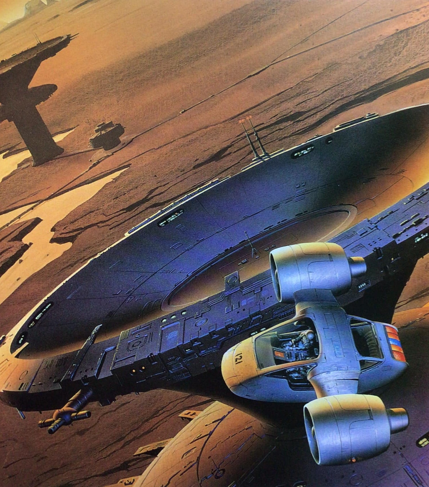
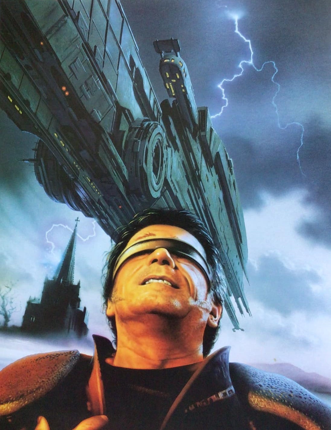
Less trompe-l'œil, though still photo-realist, is this cover for Roger Levy's debut novel Reckless Sleep. The eyeband (is that Tommy Lee Jones wearing it?) points to the novel's virtual reality technology, and the giant spaceship to the colony-planet storyline, although the lightning-struck Gothic church has no correlative in the story.
This is how Victor Gollancz/Orion Books marked-up the image as cover:
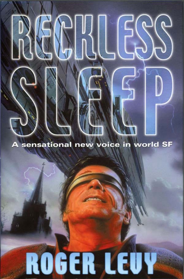
The transparent title lettering avoids occluding the space-ship portion of the composition, though the positioning of the name on the chest of the figure gives the impression that it might be a portrait of the author—I happen to know Roger Levy, and he does not in the least look like Tommy Lee Jones with a hairband over his eyes.
++++
Hyperrealism, sometimes called ‘Super-realism’ or ‘Photorealism’, was an artistic response to the development of photography. Trompe-l'œil—the phrase was coined by French artist Louis-Léopold Boilly, to refer to a painting he exhibited in the Paris Salon of 1800, although the practice is much more ancient—was a way of showcasing the technical expertise of painters in making their artworks look ‘real’. But the photographic camera can, effortlessly, reproduce what things ‘really’ look like, and as photography improved and grew in sophistication through the nineteenth- and twentieth-century, with the addition of colour, quicker shutter times, and greater density and richness of image, the role of the painter as someone who could capture the quiddity of actual visual reality was superseded. In response artists moved to other, more expressive but less photorealistic visual modes, doing things that cameras couldn’t: impressionism, fauvism, cubism, surrealism, expressionism and abstractionism. The reaction against this flight from photography, a group of artists in the 1960s and 1970s recuperated detailed and technically intensive photo-realism: British artist Malcolm A. Morley (1931 –2018), winner of the inaugural Turner Prize in 1991) applied his fine-bristle paint brush and airbrush to photorealist topics.
Other photorealist artists, like Glennray Tutor (b. 1950) or Richard Estes (b. 1932), focus on the shiny surfaces of their close-attention verisimilitude. Here, for instance, is Estes’ oil on canvas ‘Telephone Booths’ (1968).
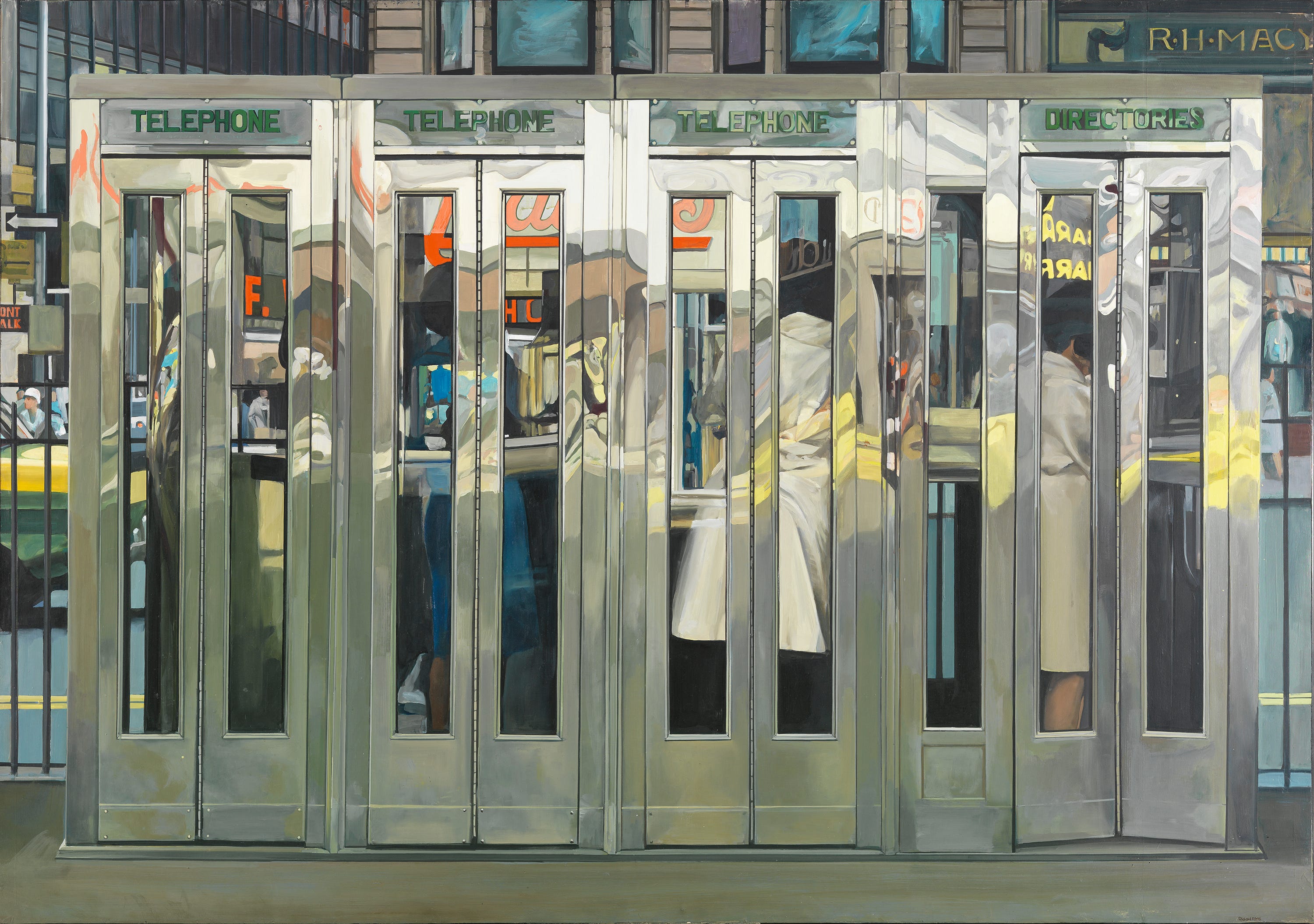
The metallic sharpness of this, its busy sterility of affect, its sense of a world defined by the machinic technology of that world, at least starts to approach the art of the science fictional. Photorealism, as an artistic movement, has remained marginal. Critics, and viewers, may admire the technique of such artists without engaging emotionally or expressively. Or, more forcefully, they may object to the whole aesthetic, as do Jean-Claude Lebensztejn and Kate Cooper:
The photorealists painted tastelessly a tasteless world: mediocre places, scrapped automobiles, nondescript people. They themselves could judge this world: to love it, to hate it, or both at once. “So I look at these things and I think wow, that really looks terrific, and it's subject-matter that's never been dealt with before”; “I think I would tear down most of the places I paint”; “I love it and I hate it”—but the works themselves let nothing of these evaluations come through. The same calm and blank gaze seemed to impose itself upon all things, and, in turn, to strike the spectator with lethargy. [Jean-Claude Lebensztejn and Kate Cooper, ‘Photorealism, Kitsch and Venturi’, SubStance, 1981, Vol. 10:2, 31 (1981) 77]
Lebensztejn and Cooper quote Estes: ‘I don't enjoy looking at the things that I paint, so why should you enjoy it.’
Does this apply to the photorealist strand in SF art? There is, we might think, a kind of contradiction, even of paradox, in the proposition: ‘to paint things that have not existed and do not exist, it is best to imitate the precise photo-mimesis of hyperrealism’ …? It is one thing to represent things that are in terms of a precise pseudo-photographic representation of their visual appearance, but does it make sense to do the same with things that are not? A different, although perhaps related question, is whether photorealist art, in am SF context, is, as Lebensztejn and Cooper suggest, kitsch, naff, bad? Or perhaps the opposite it the case: that super-realism is precisely the right idiom for SF art because, precisely if counter-intuitively, it doesn't represent the world. We do not, you and I, live in a world of continual hyperrealist apperception, and it would collapse our sensoria if we did. Gerritt Henry:
We can infer from Super Realist painting that its creators are, at heart, idealists. If reality can no longer be forced to yield up an ideal situation as it once was by classical painters, then unreality will be forced to do the same. In Photo Realism, reality is made to look so overpoweringly real as to make it pure illusion: through the basically magical means of point-for-point precisionist rendering the actual is portrayed as being so real that it doesn’t exist [in Geoffrey Battcock (ed) Super Realism (New York: Dutton 1975), 11]
The important sense in which any SF artist, visual or verbal, novelistic, cinematic of painterly, is an idealist, underpins the achievement of an artist like Moore.
Thanks for your post about Chris Moore. I recently bought the SF Masterworks edition of Babel-17, for your introduction - and, not having read Delany for decades, thought I'd try him again. But I didn't recognise the cover you posted. So I turned to my copy and found that Orion has totally ruined the cover, by washing everything green, almost eliminating the red sky, and masking most of the great detail. The original Moore is so much more striking, I don't know what audience they were hoping to attract, but surely all sf doesn't have to be turned alien-green.
Such an interesting subject! It's such a vibe, isn't it, that beautiful old-school sci-fi art.